Logo · Identity · Type · 2024
A brand that moves forward.
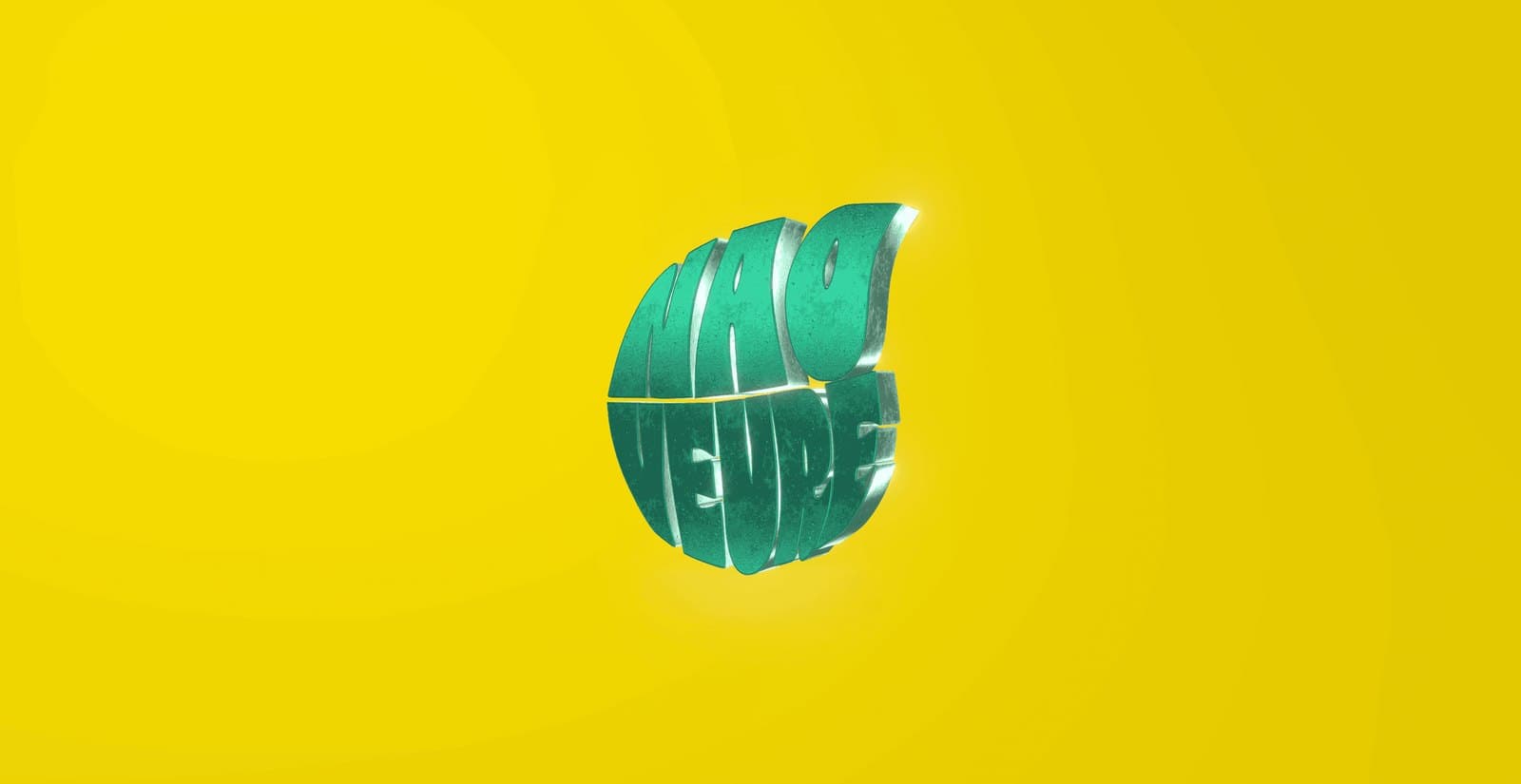
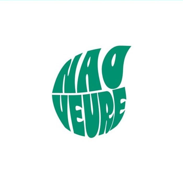
Nao Veure — “forward” in Limburgs dialect — is Fortuna Sittard's youth-development track that helps regional teenagers move forward. We drew a groovy, hand-made circular wordmark that folds the name into a single mark: playful up close, unmistakable from across the stand.
01 — The idea
The name, folded into one round shape.
We drew the letters by hand into a tight, retro-groovy circle. No existing font — every letter bends with the sphere, so “NAO VEURE” reads as one move forward.
02 — The colour system
Four colours, one groove.
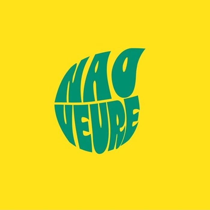
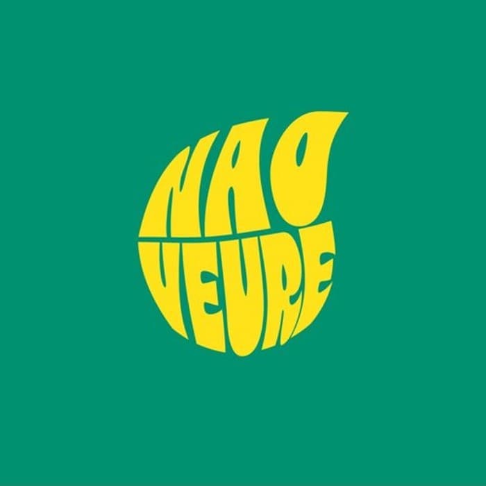
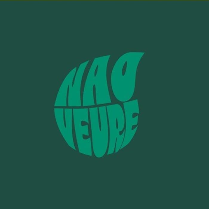
One wordmark, a flexible palette: club yellow, club green, deep green and white. At home anywhere, always Nao Veure.
03 — In the wild
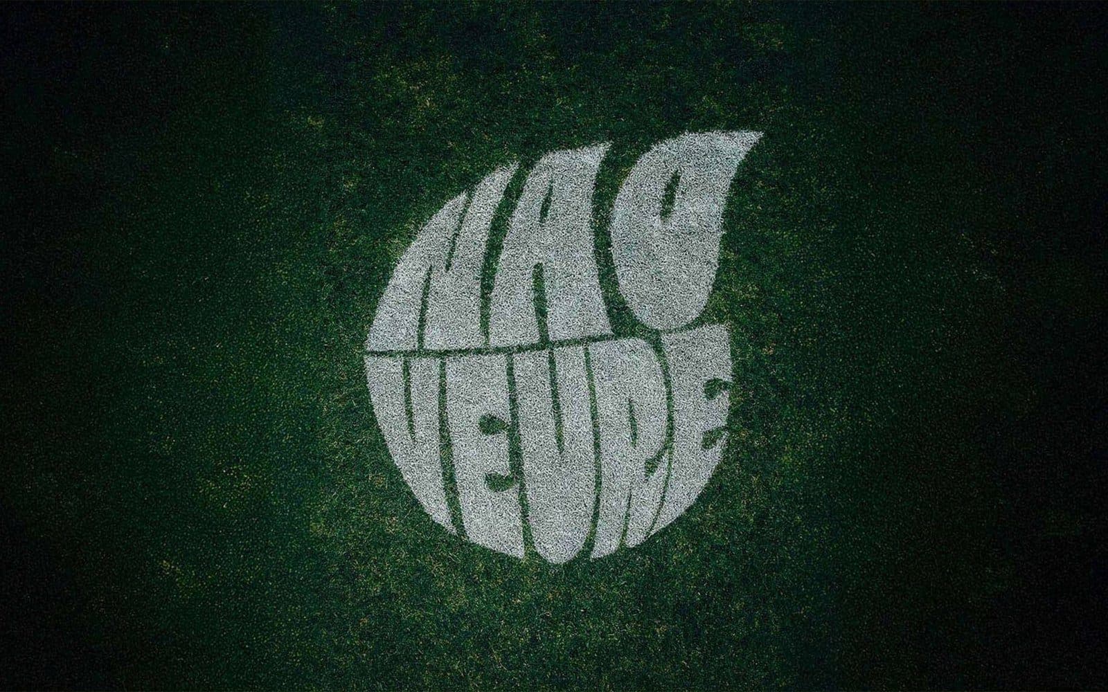
Mown into the grass.
The ultimate test of a sports brand: does it work on the pitch itself? We took the wordmark all the way into the mown grass of the field.
“With this project we give young people from the region the chance to develop and, together with Fortuna, move themselves forward toward a bright future.”
Jorg van Aarnhem
Project coordinator, Fortuna Verbindt
04 — Process
Sketch
By hand — dozens of round compositions of the name.
Draw
The letters vectorised into a single sphere shape.
Colour system
Four club colourways that work anywhere.
Apply
From social to 3D to mown into the grass.
What we delivered
Next project
Content, social & photography for Fortuna Sittard
Forward.
Up for a brand that moves?