Illustration · Art Direction · Print · 2023
Sittard & Geleen as pop art.
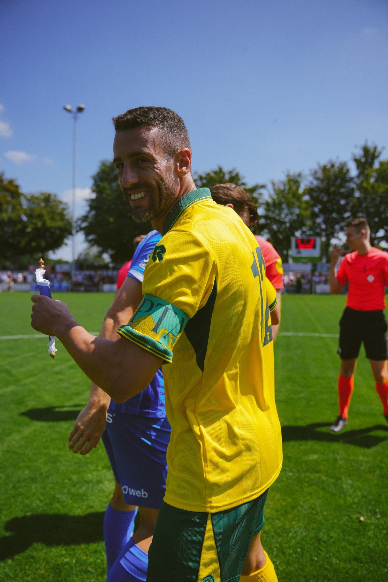
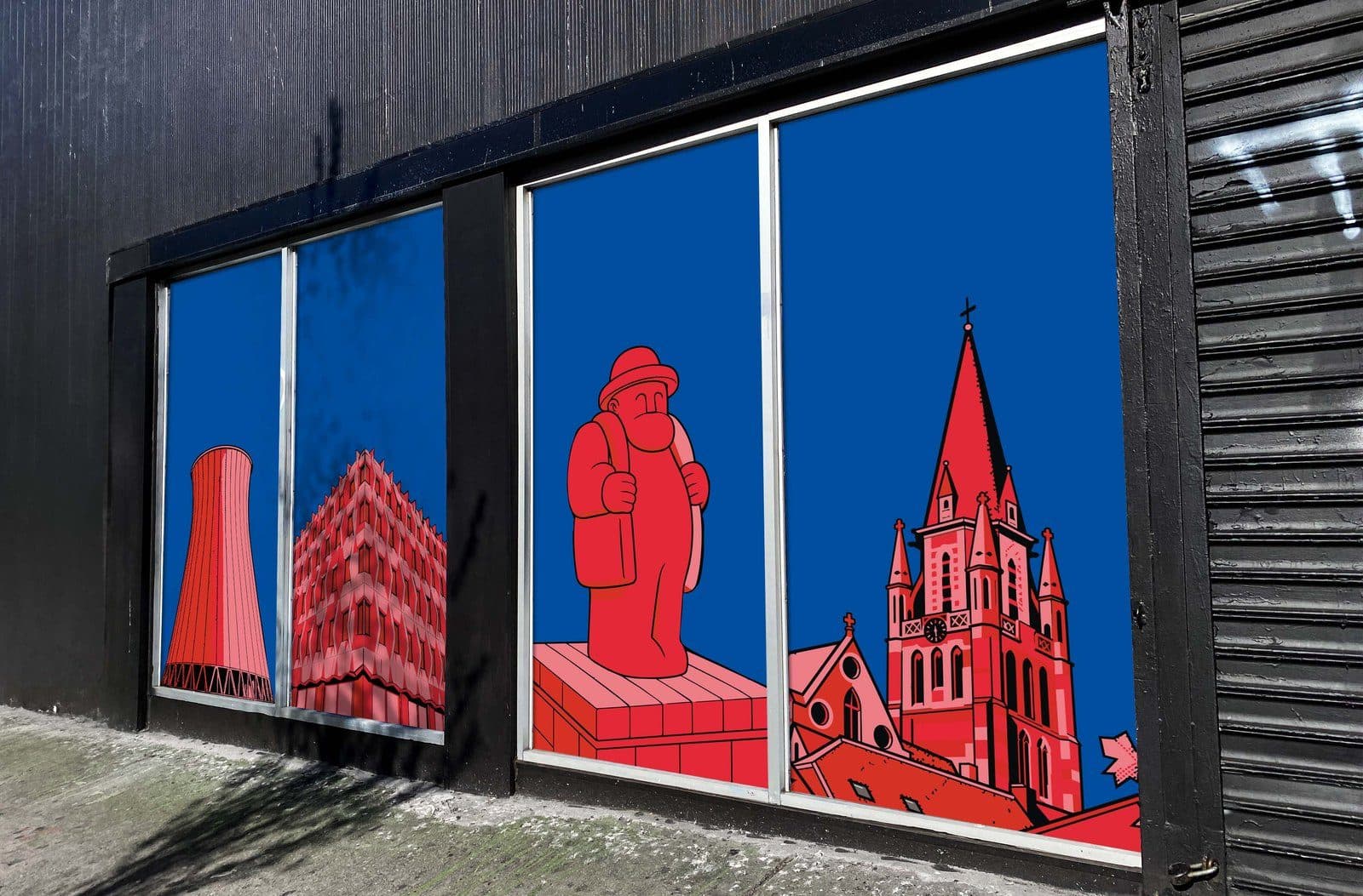
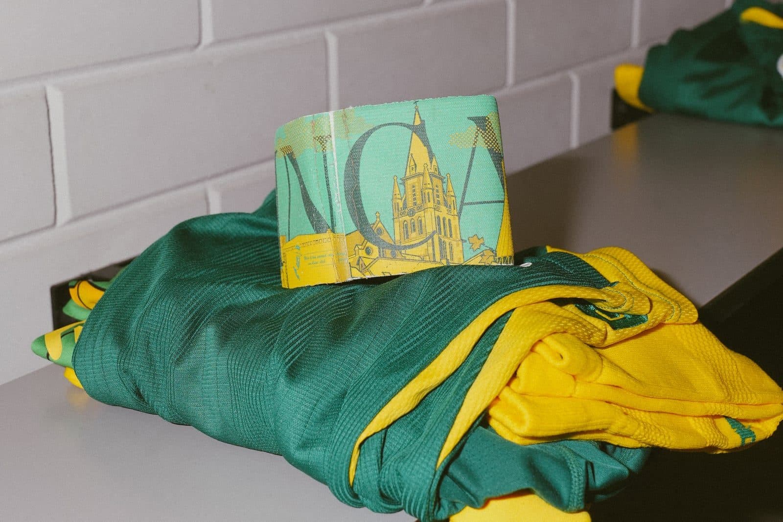
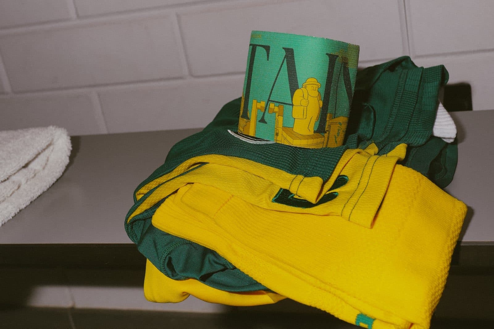
An illustrated love letter to Sittard & Geleen — its church, its cooling tower, Zefke Mols, the Stadskantoor — reimagined as bold pop art and taken from print to a full shop-window installation and Fortuna's captain armband. “Zitterd” in its own colours.
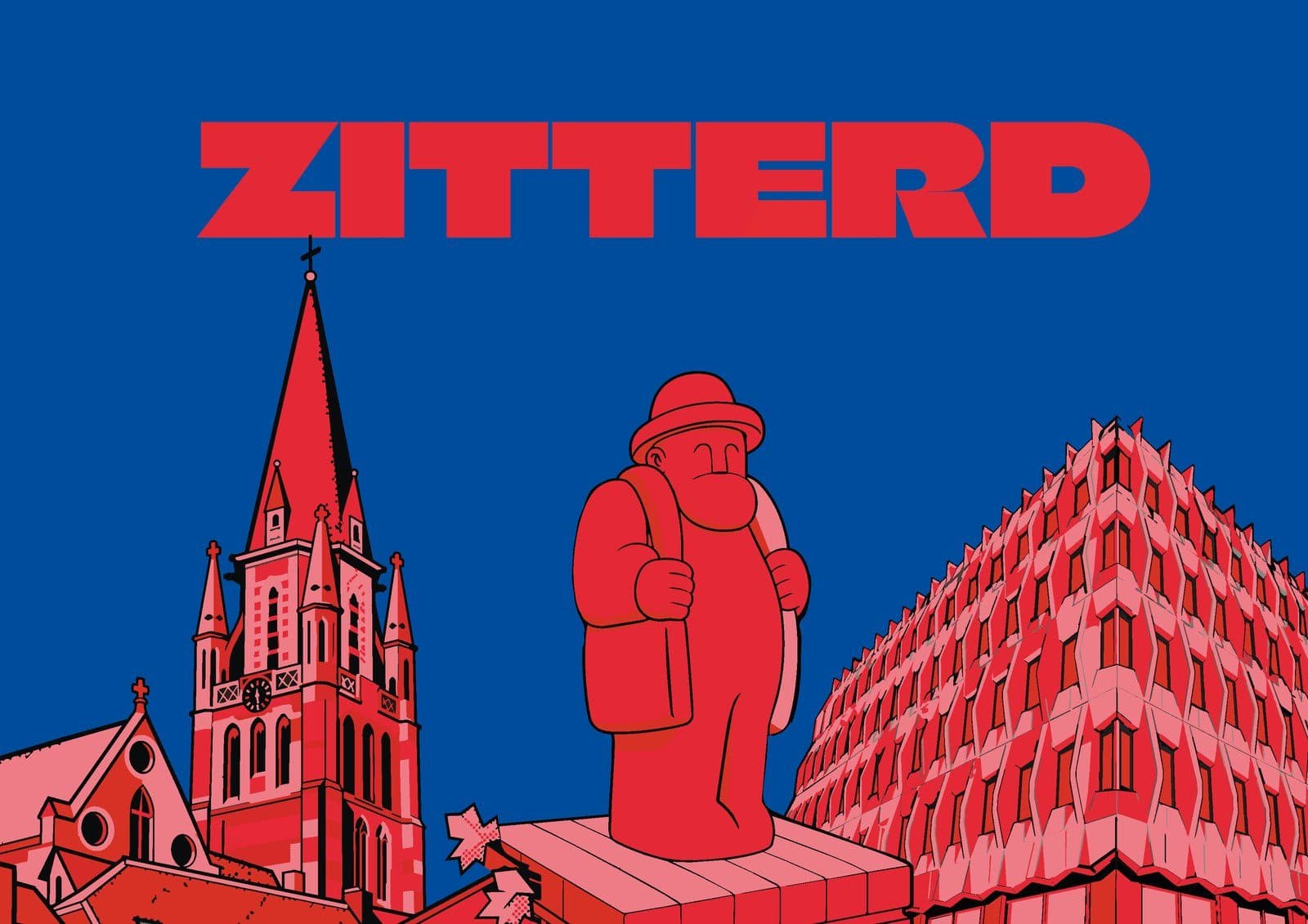
01 — Overview
The challenge
How do you make a city's landmarks feel iconic — something locals are proud to wear, hang and put in a window?
Our approach
We redrew the best-known spots as one graphic language: flat pop art, halftone shadows and duotone colourways. One system that works just as well on a poster, a window and an armband.
02 — The concept
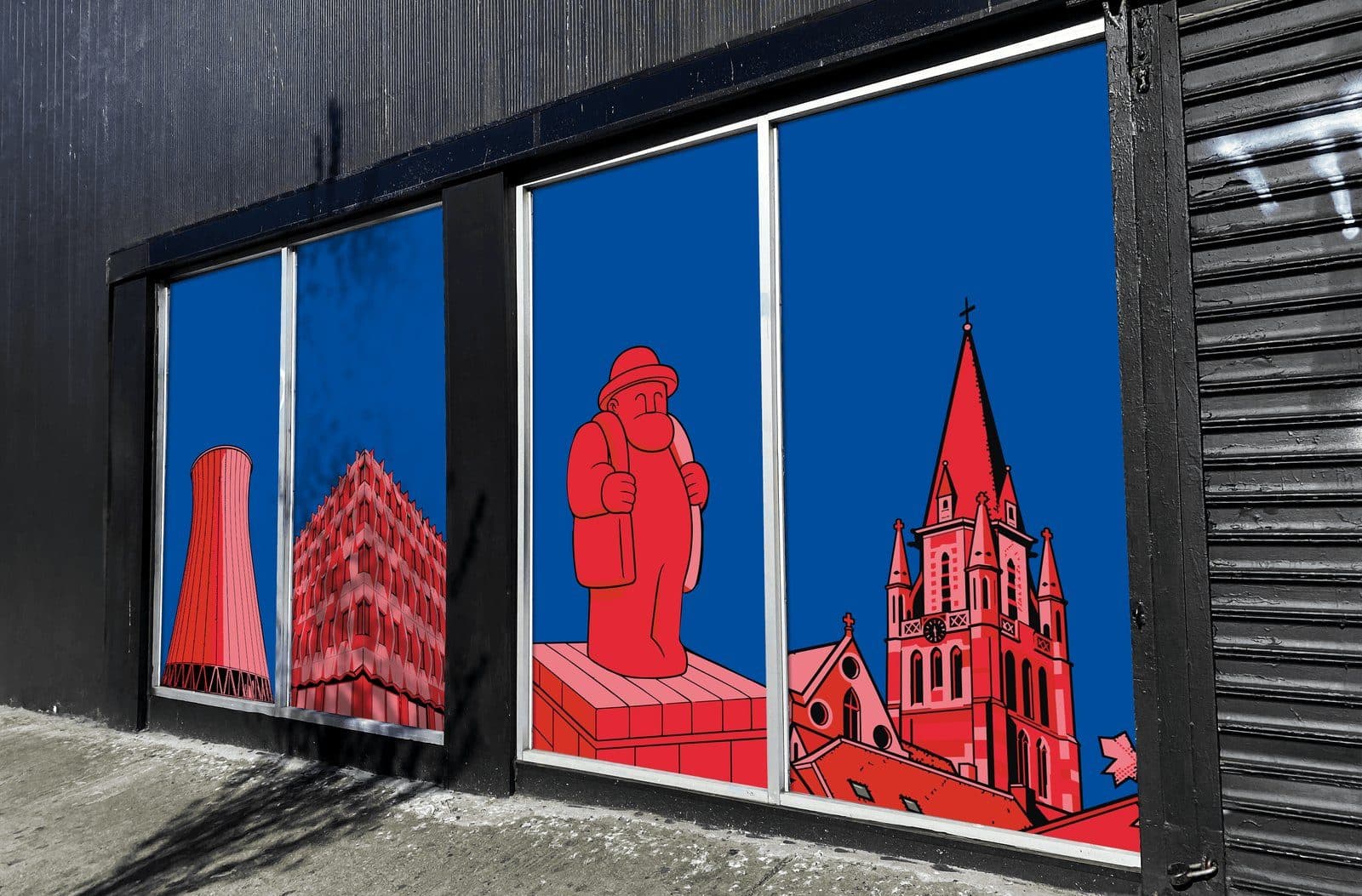
Zitterd, reduced to its silhouette.
Dialect for Sittard. We picked the places anyone from the region knows at a glance and boiled them down to bold, flat shapes — proud and unmistakable, even across the street.
03 — Art direction
Flat shapes, halftone, duotone.
One illustration style, endlessly recolourable. Each duotone gives the same landmarks a whole new mood — from club colours to city colours.
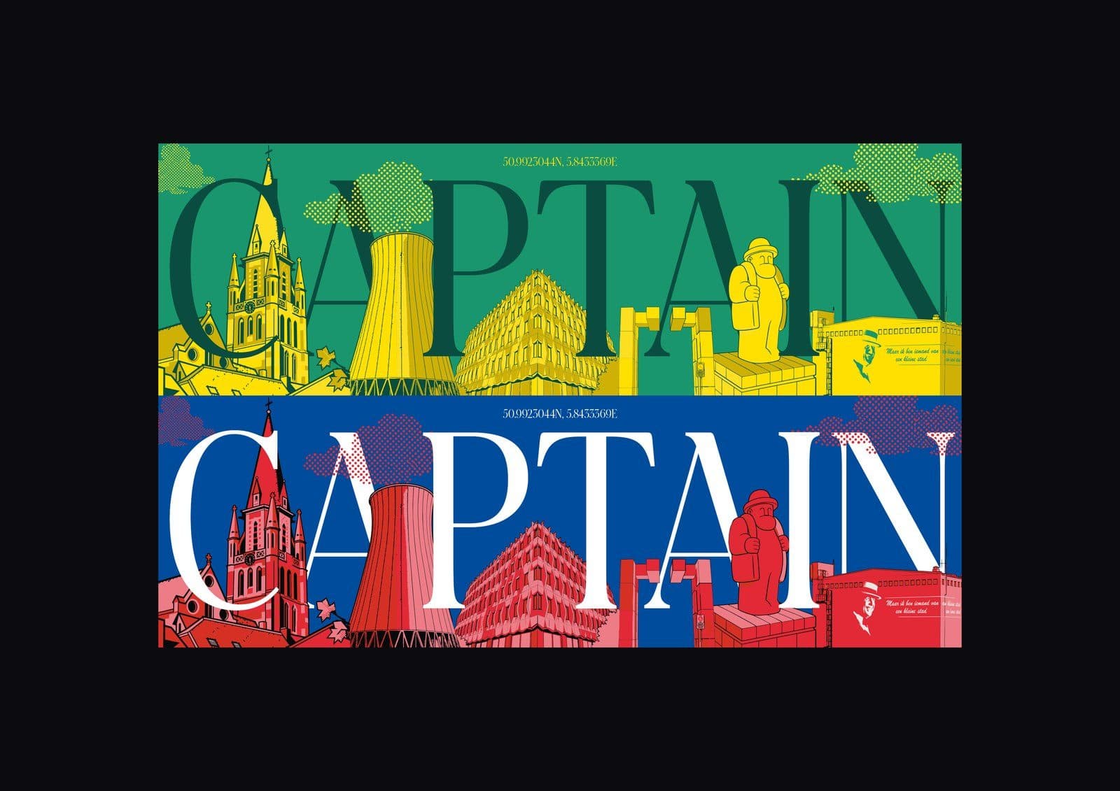
Style
- Flat pop-art shapes
- Halftone shadow
- Duotone colourways
- Bold, readable from afar
Colour
#e23a2e
#1b3fb0
#f0857f
#f4d000
#1f8a5c
#17160f
04 — In the wild
From print to a physical shop-window takeover — and even Fortuna Sittard's captain armband.
05 — Process
Research
Which places are truly Zitterd? Choosing the landmarks.
Illustration
Each landmark redrawn in one pop-art language.
Colour system
Duotone colourways — club and city colours.
Application
Print, the window installation and the captain armband.
What we delivered
Next project